This is a complete WordPress resource that guides how to create a responsive WordPress theme from scratch.
Responsive WordPress theme is a theme which enables blog or website to render well on both large and small size screen.
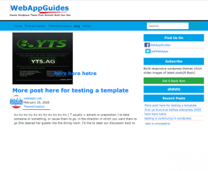
The image below is one of the WordPress templates that I will build, here it is rendering on a Laptop.
And here, the blog is displaying on a small screen.
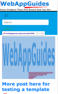
You see! Building a blog targeting mobile devices doesn’t need to build two separate pages (desktop and mobile).
An only a single page is responding accordingly on every device size if you use the right technology that is bootstrap.
I’m not sure if you are aware of this,
51.9% of global internet users use mobile devices.
So, there should be a utilization of the blog to provide good UI (User Interface) and UX (User experience) on mobile devices.
Therefore, From this guide, you will learn.
- How to build a mobile-first WordPress theme by bootstrap 4.
- How to Design good blog page structure
- How to implement blog categories and responsive menus
- How to create a working search box
- How to design sidebar and blog posts section
- How to integrate WordPress function with responsive design
- How to integrate 17 WordPress files with bootstrap
- And many more.
Hence, If you plan to build your own good designed responsive WordPress theme from scratch, these are the steps to follow.
Let’s dive in.
Install WordPress framework on localhost xampp
Initially, I’m going to use localhost(my personal computer) as a server to develop this theme.
So, I will install xampp software on my computer to set up the localhost server.
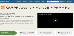
Download xampp from apache friends xampp page.
There are three types of xampp files for downloading which are xampp for windows, Linux, and Mac OS.
The installation steps are easy.
I won’t spend much here but choose xampp file that is compatible with your operating system.
After installation, configure the WordPress framework in the localhost.
After setting up the localhost, the next step is to install and configuring wordpress.
Configure WordPress on xampp
Download wordpress zip file from the wordpress official website, Here is a link, Download wordpress.
After downloading wordpress framework, do the following.
Extract files from wordpress zip file.
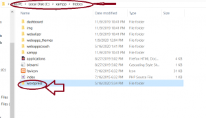
Open Local Disk C or any disk where there is xampp folder.
Open xampp folder – > htdocs folder.
Copy the extracted folder from wordpress zip folder to htdocs folder.
You can rename wordpress folder if you like.
Now our journey to create a responsive wordpress theme from scratch starts here.
Configure wordpress MySQL database
Configure wordpress by creating a MySQL database for hosting wordpress data.
So, open xampp control panel and click start to initiate apache webserver and MySQL (database server).
This will open the phpMyAdmin page of the MySQL database which you can use to create a wordpress database for hosting wordpress data.
In fact, you won’t install wordpress without specifying its database, I will show you this.
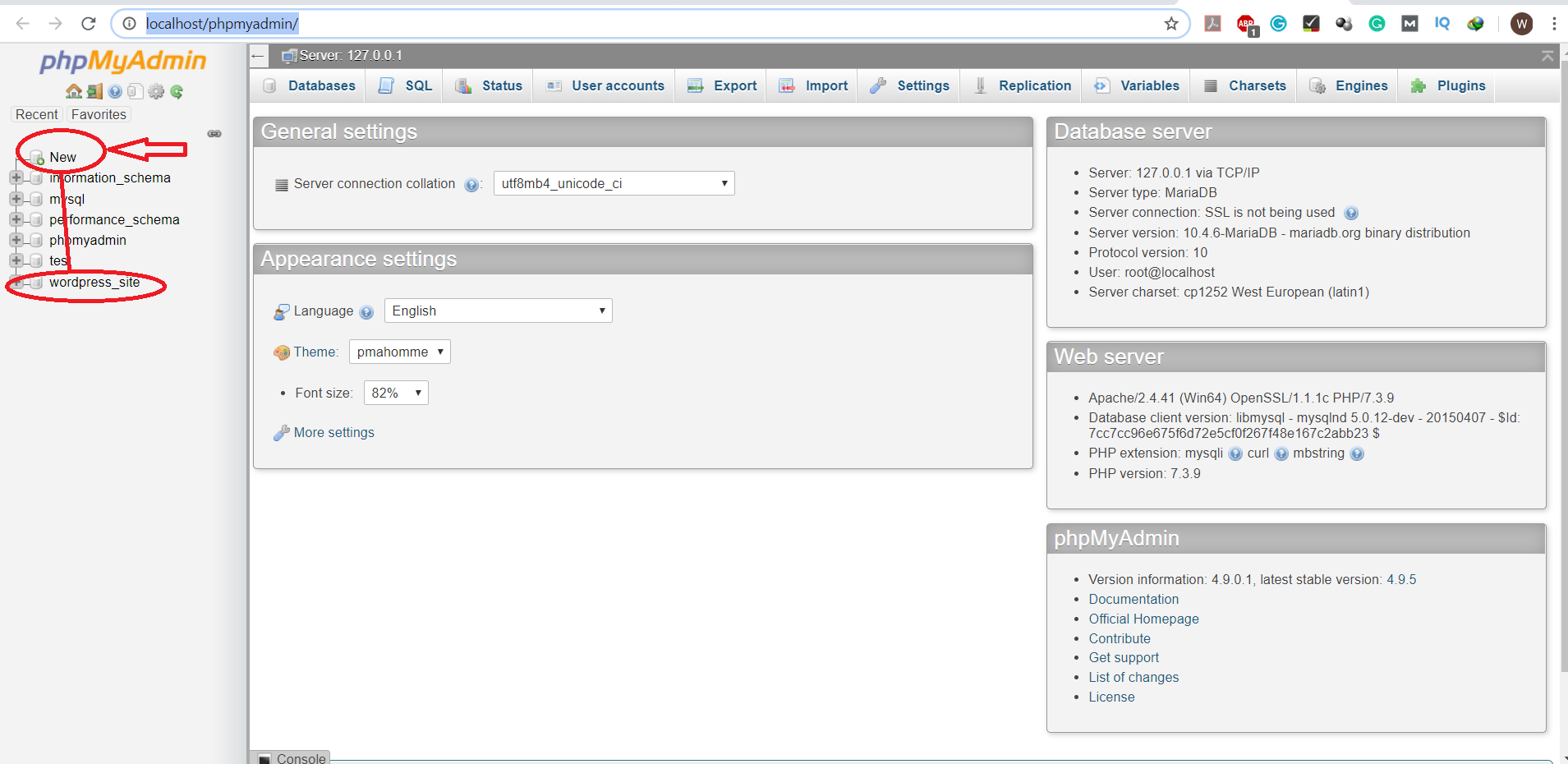
After opening the phpMyadmin page, Create a database, provide any name for the database for example wordpress_database.
how to create a database for wordpress?
On the left sidebar of the page, there is a list of various databases.
The first item written ‘New’ enables you to create a new database.
Click New to create a database.
Enter any name you want, mine as seen in the image below is wordpress_site.
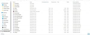
Go back to xampp folder and open htdocs then open wordpress folder.
Inside wordpress folder there is a collection of directories and php wordpress files, you should edit one among these files.
Edit wp_config.php file
Find a file named wp-config-sample.php.
Delete the word sample, let the file name be wp-config.php.
Use a text editor like notepad in windows os to open wp-config.php for editing.
wp-config.php is a very important file.
It hosts your database name, server name, and database password.
I edit wp-config.php using notepad++ text editor.
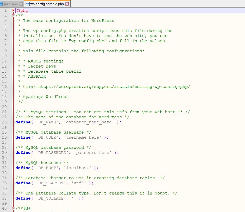
Inside this file, there is code which is php function written define().
define() takes in some arguments.
- Database name you created earlier
- Database username
- Database Password
- The domain of the server (serverName) which is the localhost.
Enter a database name in a first define function.
For example, my database name is wordpress_site.
Then.
define(‘DB_NAME’,’wordpress_site’)
For a database user name,
define(‘DB_USER’, ‘root’)
Then, put a database password.
In xampp, a default database password is empty.
Hence, a define() function parameter for password is ……
define(‘DB_PASSWORD’, ‘ ’)
And lastly, set up the hosting server name.
It is ‘localhost’.
define(‘DB_HOST’, ‘ localhost’)
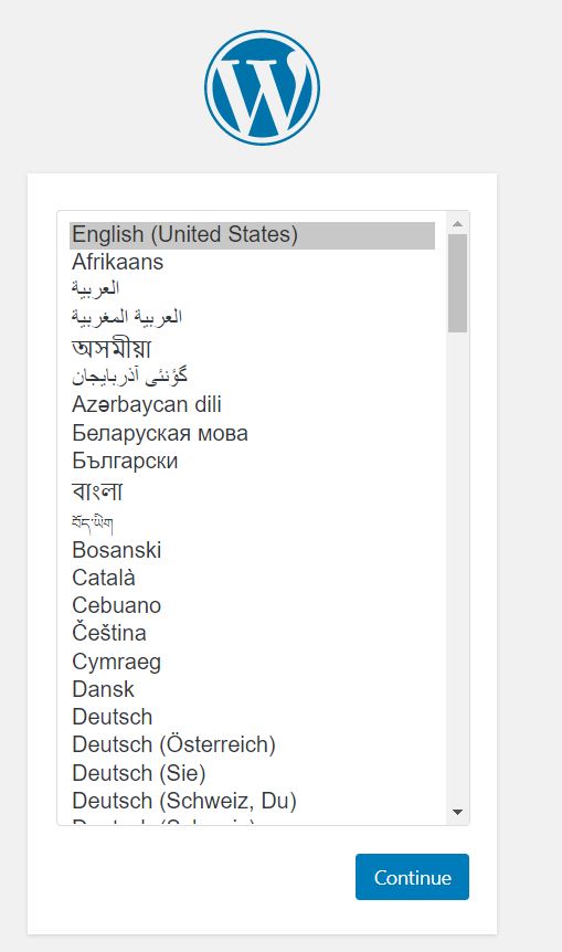
Open a browser to install wordpress.
The configuration file has already passed the required data for installing WordPress blog.
Enter a link in the browser pointing wordpress folder like http://localhost/wordpress.
This brings a page for selecting the language you prefer.
Another page for entering additional information will appear.
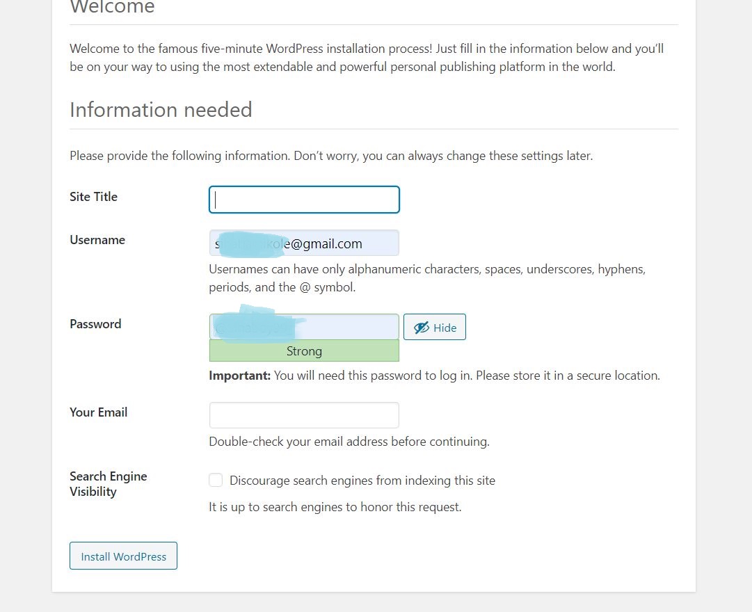
As it is seen, fill wordpress needed information and click Install WordPress.
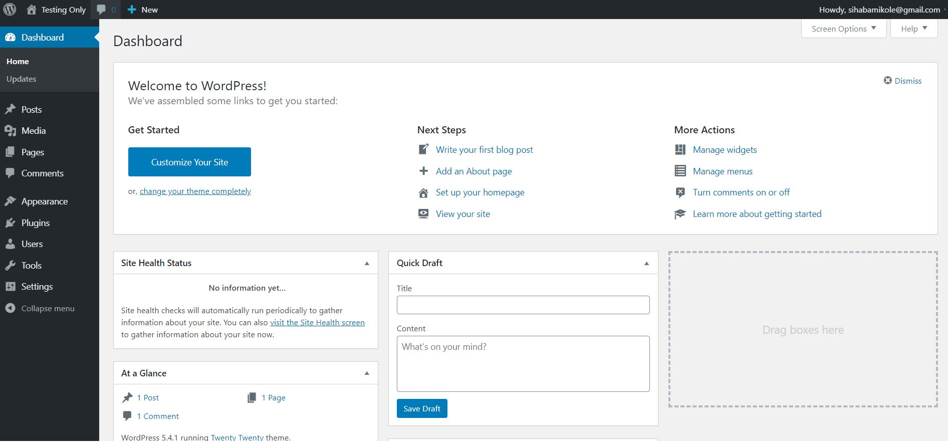
If the installation is complete, a WordPress admin dashboard page will appear.
You will see the blog name at the top left corner of the page.
So, Clicking the link takes you to your blog, right now blog uses a built-in template.
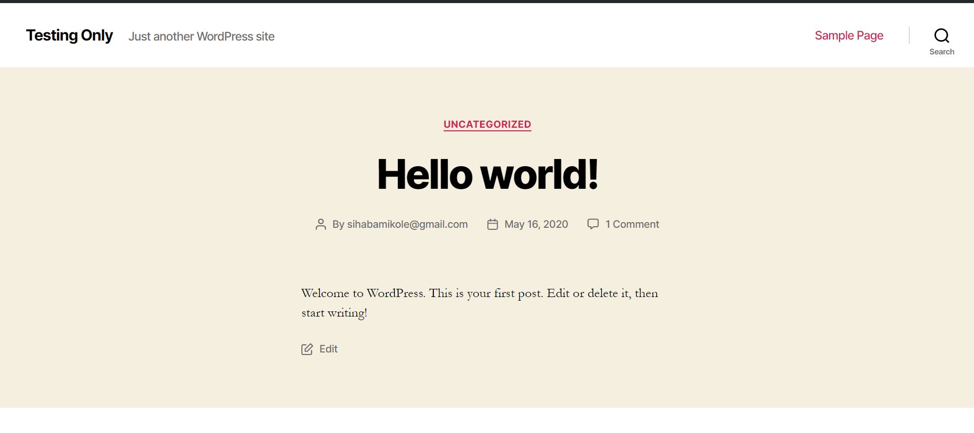
This my wordpress site with one post with title HELLO WORLD.
We want to build our own theme, the next step is to design a responsive HTML layout using bootstrap.
Responsive WordPress theme designing.
As I wrote earlier, you will use bootstrap version 4 to create a responsive wordpress theme from scratch.
What is bootstrap exactly?
Bootstrap is the free and open source CSS framework targeting to design mobile-first sites.
So, incorporate bootstrap in a theme folder.
I will show the directory where the theme folders reside.
For now,
Download bootstrap framework.
After that.
Create a directory for your wordpress theme.
Here, it is how to do it.
Open xampp folder -> open htdocs -> open wordpress folder then wp-content.
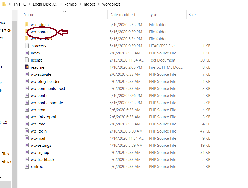
This is the folder for saving themes. you will find other wordpress themes within wp-content.
So, create a new folder and rename it to any name.
That will be the name of your wordpress theme.
My folder name which is the theme name is “testingtheme”.
WordPress themes directory ie testingtheme hosts all php files which make blog alive.
You will create those files later on.
But right now, go back to the designing first.
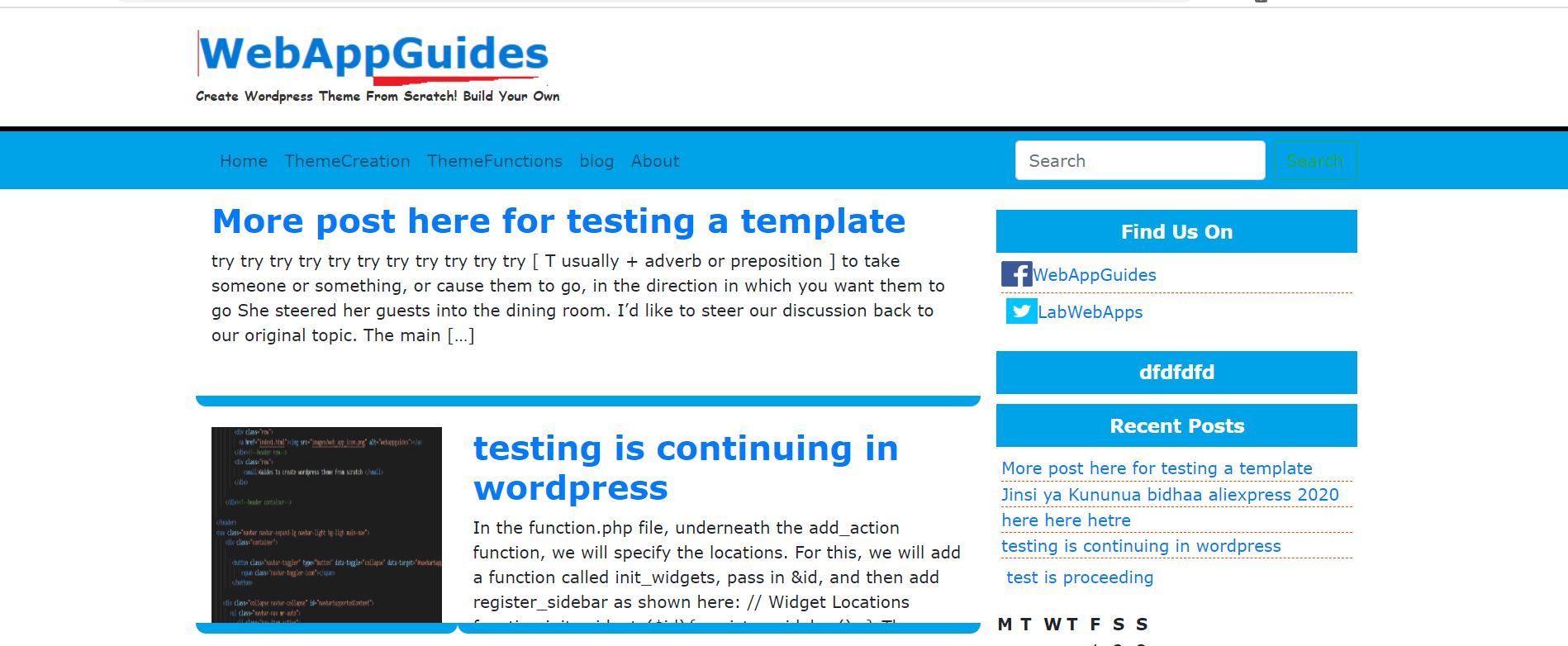
Design blog post page layout using bootstrap
I am going to design something like this …
Although, I will cover the next parts.
Our first responsive HTML page for the blog will consist of the following feature.
- Blog Name
- Blog description
- Title of the post
- Bootstrap menu
- Search field and search button
- Post thumbnail
- Sidebar
- Footer Menu.
Divide the design of a blog page into three sections.
- Header
- Main Body
- Sidebar
- Footer
So, create a temporary folder at desktop where you will put HTML pages name folder testingtheme or any name.
Extract bootstrap zip file to testingtheme folder.
Now and onward you will need a text editor.
I recommend visual studio code or notepad++ text editor.
But for me, I use Microsoft Visual Studio Code.
Here is the link to download Microsoft visual studio code.
You can find other versions for Linux and Mac in this link https://code.visualstudio.com/download
Head to a temporary folder (testingtheme folder) at the desktop.
Open the folder and click the mouse right-click button.
Choose Open with code, in fact, you open the folder in Visual studio code.
The visual studio code sidebar displays the list of folder files.
It is empty right now.
Files to be created in visual studio code.
Right now, create two files only.
- index.html
- style.css
But complete flexible wordpress themes shall consist of at least ten(10) php files.
Therefore, you will create the following files for creating a responsive wordpress theme from scratch.
- index.php
- functions.php
- style.php
- search.php
- single.php
- page.php
- comments.php
- footer.php
- header.php
- archive.php
- wp-bootstrap-navwalker.php
Integrate bootstrap with index.php
Extract bootstrap to a temporary that is testingtheme folder at the desktop.
And don’t forget to download jquery Then move jquery to this folder( testingtheme).
So, right-click a sidebar of the visual studio code then choose New file and name the file as index.html
Now in index.html file, codes should look like this.
<!DOCTYPE html>
<html>
<head>
<title>TestingTheme-Create Responsive Wordpress Theme From Scratch </title>
</head>
<body>
</body>
</html>
Integrate style.css and bootstrap CSS framework in the above HTML codes.
To integrate CSS, enter the following HTML codes below <head> tag.
<link rel= “stylesheet” href = “style.css”>
<link rel= “stylesheet” hrem= “bootstrap/css/bootstrap.min.css”>
For a page to react according to the size of a screen, there should be a meta tag which manages smooth rendering.
So, add the following meta tag.
<meta name="viewport" content="width=device-width, initial-scale=1">
This meta tag has three parts.
Viewport – represent the visible area of a page.
Contents receive the width of a device, initial-scale define the ability of page zoom,
if the value is 1 a page can be zoomed, 0 no zoom.
The new HTML structure in the head tag will become
<!DOCTYPE html>
<html>
<head>
<link rel= “stylesheet” href = “style.css”>
<link rel= “stylesheet” href= “bootstrap/css/bootstrap.min.css”>
<meta name="viewport" content="width=device-width, initial-scale=1">
<title>TestingTheme-Create Responsive WordPress Theme From Scratch </title>
</head>
<body>
</body>
</html>
Move inside <body> tag near </body>
Add the following codes lines.
<script src=”bootstrap/js/bootstrap.min.js“></script>
<script src=”jquery/jquery-3.4.1.min.js“></script>
<script src=”bootstrap/js/bootstrap.bundle.js“></script>
<script src=”js/popper.min.js“></script>
The codes integrate jquery and bootstrap javascript files necessary for handling some events on page.
Remember bootstrap framework needs a jquery library.
Therefore you should download jquery and place it in a folder, call it jquery.
Html codes inside <body> will become as follows
<body>
<script src=”bootstrap/js/bootstrap.min.js“></script>
<script src=”jquery/jquery-3.4.1.min.js“></script>
<script src=”bootstrap/js/bootstrap.bundle.js“></script>
<script src=”js/popper.min.js“></script>
</body>
</html>
The configuration of bootstrap and jquery library is over now.
Now it is time to design the four parts which compose a page listing blog post.
Design Blog Header.
The header is the top part of the page main body.
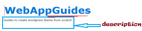
It is section where I will put the name of the blog and description.

The header hosts a logo name of the blog “WebAppGuides” and blog description.
In the second part of this guide, you will implement wordpress function for site url.
How do you design that?
Here it is how…
Insert the following code below <body> element.
<header>
<div class="container">
<div class="row">
<a href="index1.html"><img src="images/web_app_icon.png" alt="webappguides"></a>
</div><!--header row-->
<div class="row">
<small>Guides to create wordpress theme from scratch </small>
</div>
Briefly Explanation of each line of the above piece of code.
<head> element- specifies the section is to be a header.
I put images and descriptions inside the header.
After the header element, it follows <div> with a class of container.
A class container is a bootstrap class that sets the left margin and right margin of all tags.
And contents that are inside the container.
Check the image for more clarification.
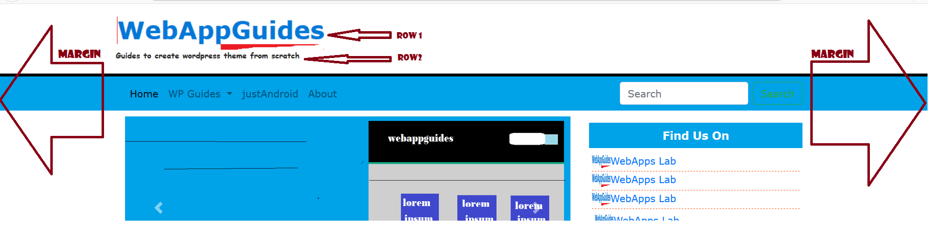
In case you remove the class container a log and description would start at the most left part of the header something that we don’t want.
And in addition, your theme will not have a responsive header.
You must ensure is template is responsive everywhere.
The next element is <div class= “row”>.
This div element has a class of row,
A row is just a line of things as you can see the image above.
The first row has an image of my blog logo, the code below sets the image.
<img src=”images/web_app_icon.png” alt=”webappguides”>
Now a full code of img tag is like this
<a href=”index1.html”><img src=”images/web_app_icon.png” alt=”webappguides”></a>
What is <a> tag?
It is an anchor tag used for creating a link through href attribute set the file to open when a user clicks ie index,html
In fact, you have to make a logo image as a home button and that is how you set.
The last part of the header section is another row that displays the blog description.
Html element for this.
<small>Guides to create wordpress theme from scratch </small>
Create another row by <div class= “row”> then you write the above code.
If you have written a header section like this, the page will render like this…
Create a new file in your visual studio code text editor called style.css if you haven’t created a file.
Set the header background color to white.
Also set border at the bottom with black color.
Lastly, Set a content space of 20 pixels.
To style html element first you write
header{
background: #fff;
border-bottom: #000 solid 5px;
padding: 20px;
}
Change description text style
I don’t like the font family of the description, to me, it looks very bad.
So, I will use a cursive font family to change the description text style.
The description will have some sort of italic and font-weight of bold with a reduction of text size.
Write the following in style.css
header small{
color: #333;
font-weight: bold;
font-family: cursive;
}

Design Responsive Navigation Menu.
Responsive navigation menu is the menu which reacts by creating an icon
It is an icon which holds list of menu items on small size devices or screen.
When user clicks the icon, menu displays all navigation items
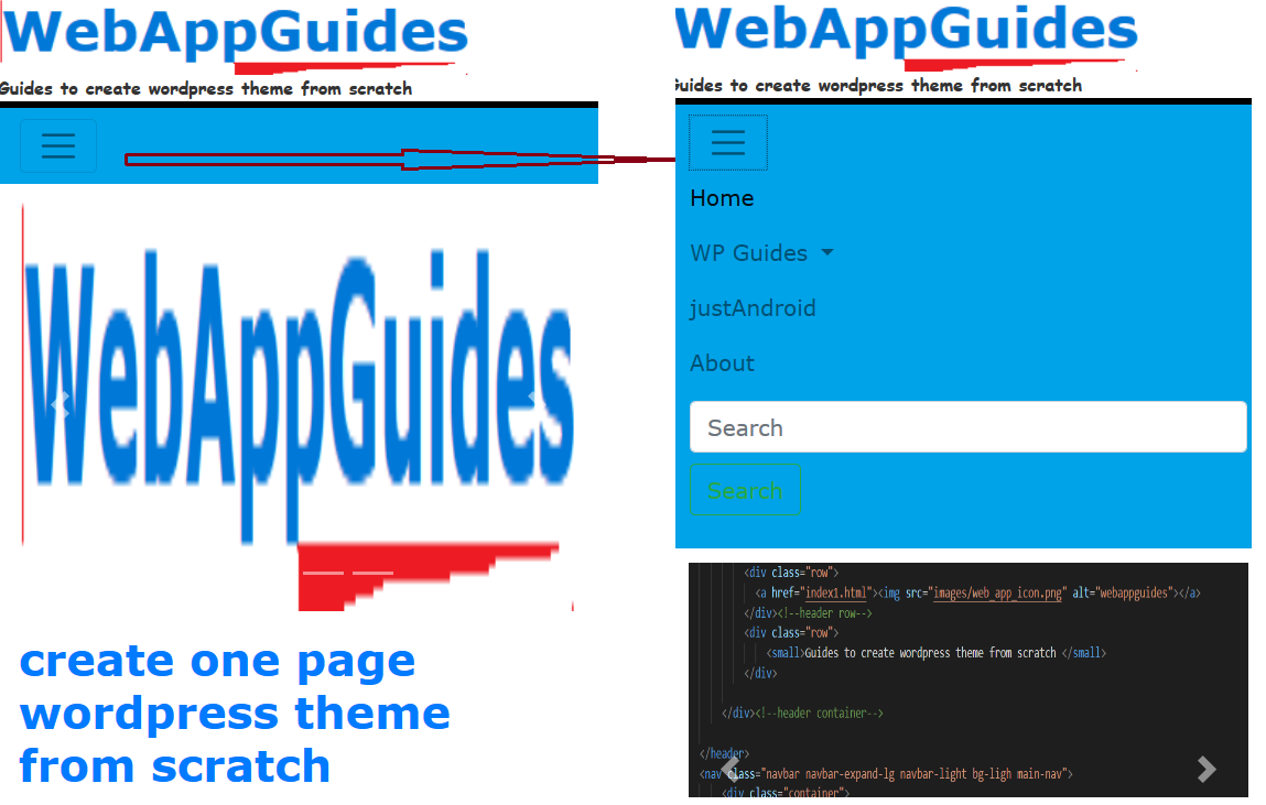
And also, the navigation shows all menu items when the page is rendered on a large screen like a laptop.

Remember, the goal is to create a responsive wordpress theme from scratch.
So, I should make everything appear on the blog responsive.
I will use the bootstrap navigation menu for responsiveness purposes.
Here are the steps.
Step #1: Open index.html then write the following codes below </header> element
<nav class=”navbar navbar-expand-lg navbar-light bg-ligh main-nav”>
<div class=”container”>
<button class=”navbar-toggler” type=”button” data-toggle=”collapse” data-target=”#navbarSupportedContent” aria-controls=”navbarSupportedContent” aria-expanded=”false” aria-label=”Toggle navigation”>
<span class=”navbar-toggler-icon”></span>
</button>
<div class=”collapse navbar-collapse” id=”navbarSupportedContent”>
<ul class=”navbar-nav mr-auto”>
<li class=”nav-item active”>
<a class=”nav-link” href=”#”>Home <span class=”sr-only”>(current)</span></a>
</li>
<li class=”nav-item dropdown”>
<a class=”nav-link dropdown-toggle” href=”#” id=”navbarDropdown” role=”button” data-toggle=”dropdown” aria-haspopup=”true” aria-expanded=”false”>
WP Guides
</a>
<div class=”dropdown-menu” aria-labelledby=”navbarDropdown”>
<a class=”dropdown-item” href=”#”>Creating Themes</a>
<a class=”dropdown-item” href=”#”>WP Functions</a>
</div>
</li>
<li class=”nav-item”>
<a class=”nav-link” href=”#”>justAndroid</a>
</li>
<li class=”nav-item”>
<a class=”nav-link” href=”#”>About</a>
</li>
</ul>
<form class=”form-inline my-2 my-lg-0″>
<input class=”form-control mr-sm-2″ type=”search” placeholder=”Search” aria-label=”Search”>
<button class=”btn btn-outline-success my-2 my-sm-0″ type=”submit”>Search</button>
</form>
</div>
</div>
</nav>
I will not tell the above code in detail.
But bootstrap classes from the above code makes navigation responsive.
The navigation background color is white for now.
I will change this bootstrap navigation menu to light blue.
Step #2: Open style.css for setting the background color to light blue.
Write the following code.
nav.main-nav{
background: rgb(0,162,232);
height: auto;
}
Html element for creating is <nav>.
Inside nav, I set attributes that use some bootstrap classes.
But also, I added my own class which I call main-nav.
That’s why I referenced the element by writing nav.main-nav.
Reload the page, now the navigation background color is light blue.
Design sidebar and a section for blog posts
Create a container that holds one row.
A row should contain two columns.
Design the first column for blog post and the second column for sidebar contents.
To create the main part for blogs and sidebar, do the following.
Write the following lines bellow </nav> element.
step #1: Start writing <div class= “container”>
The codes will be.
<div class= “container”>
I will place codes for columns here
</div>
A blog post section which is column occupies large space while sidebar parts is small.
In the bootstrap grid system, a row contains 12 columns.
There are classes that specify the number of columns some elements can occupy in the bootstrap rows.
The bootstrap class for columns is in this format col-md-12.
Col means column
md means Medium
12 means 12 columns.
Therefore, calling col-md-12 class makes the contents occupy the entire screen.
So, to divide the row into two parts (main section and sidebar),
I will write two div elements with two col-md classes.
The first column occupies 8 columns.
The codes …
<div class= “col-md-8>
The second column occupies 4 columns, this makes 12 columns
<div class= “col-md-4”>
Complete codes become …..
<div class=”container”>
<div class=”row”>
<div class=”col-md-8″>
I will put blog posts here
</div>
<div class=”col-md-4″>
I will put sidebar contents here
</div>
</div>
</div>
Design Blog Post Section
Blog post involves four parts.
- Title of the post
- Author information
- Post description
- Link button for reading entire contents.
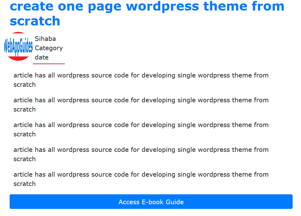
The blog part contents are hosted in <article> element.
I want a big blog title, this makes a theme to be visible by a user.
Therefore, I will employ heading level 2 that is h2
<h2><a href=”#“>create one page wordpress theme from scratch</a></h2>
Then, I will design author image to be a circle image.
<img src="images/webapp logo.PNG" alt="webapps log" style="border-radius: 50%;" width="75px" height="75px">
I put author’s meta data on the right side of author image.
<p class=”author”>
Sihaba<br>
Category<br>
date<br>
</p><!–author–>
Then, followed by article element and last one is link button.
I wrote article content using paragraph tag.
<p> article has all wordpress source code for developing single wordpress theme from scratch</p>
And link button.
<a href=”#con” class=”btn btn-primary” style=”width: 100%;”>Access E-book Guide</a>
Actually, I have used bootstrap button classes to create a button.
The first class is btn then I set the color button by selecting another class “btn-primary”
Learn more about bootstrap button here
This complete codes. . . . . .
<!–loop here–>
<div class=”row”>
<div class=”col-md-12″>
<!–loop here–>
<article class=”post”>
<h2><a href=”#”>create one page wordpress theme from scratch</a></h2>
<div class=”row meta”>
<img src=”images/webapp logo.PNG” alt=”webapps log” style=”border-radius: 50%;”
width=”75px” height=”75px”>
<p class=”author”>
Sihaba<br>
Category<br>
date<br>
</p><!–author–>
</div>
<p> article has all wordpress source code for developing single wordpress theme from scratch</p>
<p> article has all wordpress source code for developing single wordpress theme from scratch</p>
<p> article has all wordpress source code for developing single wordpress theme from scratch</p>
<p> article has all wordpress source code for developing single wordpress theme from scratch</p>
<p> article has all wordpress source code for developing single wordpress theme from scratch</p>
<a href=”#con” class=”btn btn-primary” style=”width: 100%;”>Access E-book Guide</a>
</article>
</div>
</div>
<!–loop here–>
I placed these lines of codes inside the first column <div class= “col-md-8”> because it is where I wanted to be the main parts where blog posts appear.
You see the comments “loop here”, These remind me that this part should show all the blog posts.
Since the blog can have more than one post, a while is used to display all posts.
In fact, wordpress framework has a method called have_posts() which checks if the blog has the posts.
But this is just a designing part, So I’m not implementing wordpress functions this time.
If you copy the codes above, your design adds title, post, author data, and button.
Save and Reload a page.
The next nesign is sidebar.
Design sidebar
Sidebar is just a part which can be set on left side or right side.
It depends where you want it to appear.
I set sidebar on the right side! Remember <div class= “col-md-4”>?
I want to put some additional information on sidebar.
My sidebar shows my social networks account, e-books promotion.
You can add more things as much as you can.
I want the sidebar widget title to have background color of blue, it is light blue.
It is to do this.
Go below <div class = “col-md-4> and insert this code block.
<div class=”col-md-4″>
<div class=”social”>
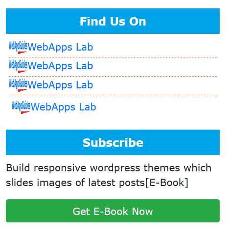
<h3 id=”title”>Find Us On</h3>
<ul>
<li><img src=”images/web_app_icon.PNG”><span><a href=#fb>WebApps Lab</a></span></li>
<li><img src=”images/web_app_icon.PNG”><span><a href=#fb>WebApps Lab</a></span></li>
<li><img src=”images/web_app_icon.PNG”><span><a href=#fb>WebApps Lab</a></span></li>
<li><img src=”images/web_app_icon.PNG”><span><a href=#fb>WebApps Lab</a></span></li>
</ul>
</div>
If you reload, the will look like this.
Open style.css to give a sidebar good looking.
First thing, from the above code sidebar widget title uses h3 (heading level three).
I set the id to “title”, I will use this id in style.css to style the heading.
Here, it is how to do it.
.sidebar{
width: 100%;
padding:5px;
margin-bottom: 10px;
}
Then styling a title.
.social .title{
background:rgb(0,162,232);
padding: 10px 10px;
color: #fff;
font-weight: bold;
font-size: 18px;
text-align: center;
}
Styling items in list.
.social ul{
padding-left: 5px;
padding-right: 5px;
}
.social ul li{
list-style: none;
border-bottom: orangered dashed 1px;
}
The design part is over.
So our is responsive right now.
The next section is wordpress programming.
It is all integrating wordpress with the design.
The second part of this tutorial is here.